The Quest for an Alternate User Interface
posted by Shane on 31st October 2014, at 10:21pm | Discuss ArticleIt was 2007 and usable touchscreens were the domain of Star Trek. The iPhone was unveiled with a touchscreen keyboard, two of its many purposes were to provide more screen real estate and allow for any type of keyboard to be used on the device. Smartphones of the past often relied on physical keyboards and touch displays that weren’t all that accurate. The iPhone changed all of this. A new era was upon us.
The iPhone didn’t outright start a new era of user interface experimentation but it certainly enabled it. The App Store arrived with a future iPhone OS (not iOS yet) release, this encouraged and often required developers come up with new interface paradigms. Many interface paradigms came up over time, here are a few of my memorable ones:
- Swipe a list item (e-mail mostly) to the left to show a delete button.
- Pull to refresh. First created for Tweetie on iOS. Allows the user to request an updated set of data without pressing a button.
- Infinite scrolling. Be gone pagination!
These three examples all started out isolated into their respective applications. Over time they became ubiquitous to the iPhone platform and eventually Apple included API support for them. By including support for these paradigms in the official developer APIs these became the standard way of representing these actions on a multi-touch display.
While we can marvel at the advent of smartphones and all the good they’ve done for the application ecosystem (on mobile and desktop) there’s an underlying theme: mavericks. Early developers on smartphones could have simply tried to re-create the desktop experience that everyone knew. They didn’t and for good reason. Microsoft tried this with early versions of Windows Mobile and it wasn’t the best experience. It also comes down to developers wanting to create something new. Something interesting, something that hasn’t been done before. The developers became mavericks overnight. It’s this underlying theme of developers wanting to create something new and exciting combined with an experience that doesn’t work or is purely ancient that leads us to a new future of interaction.
Throughout the rest of this piece I plan to highly some of my favourite hardware devices and pieces of software that advance computer interaction in novel ways. These are pieces of software that are in some cases misunderstood but with enough time and appreciation enhance my experience in ways that are often hard to describe.
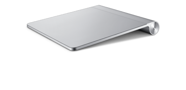
Magic Trackpad and Magic Mouse
Two of my favourite peripherals that I own are the Magic Trackpad and Magic Mouse. The Magic Trackpad gets daily use while the Magic Mouse does not due to the fact it causes me too much wrist pain. Trackpads generally have a poor reputation due to the undersized and poorly responsive trackpads found on PC laptops. The truth is that a trackpad combined with the proper software is infinitely superior to a mouse.

Since OS X 10.7 Apple has provided an excellent interface for the Magic Trackpad. With the most recent release, Yosemite (10.10), the trackpad provides the most futuristic OS X experience one can find. With a 3 finger swipe it’s possible to switch applications without moving the cursor. With a two finger swipe from the right it’s possible to access system notifications and widgets. With a 3 finger pinch it’s possible to launch any application from Launchpad (Apple’s home screen like display for OS X). Also, the Magic Trackpad provides all the gestures available to users on iOS (scrolling, pinch to zoom, rotation, etc.)
The purpose of this section is not to tout the superiority of the Magic Trackpad above all others, it illustrates a point. With enough careful consideration, the refinement of an age old hardware device when paired with the appropriate software can create an entirely new experience for end users. While not immediately outright both the Magic Trackpad and Magic Mouse do provide that necessary stepping stone to advance our computer interactions into the future.
Clear – Simple Todo Lists for iOS and OS X
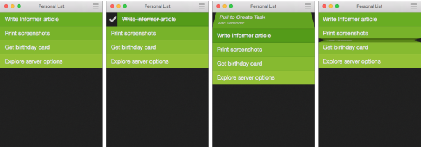
Clear takes what should be simple and ensures it’s just that. Clear arrived in February 2012 on iOS and grabbed my attention immediately. At the time I was looking for a new Todo list manager and was even contemplating writing my own. Clear took that need away as soon as I saw the first promotional video. Clear provides a clutter free UI that has no buttons and relies completely on gestures. Clear attempts to show us how we should interact with a touchscreen device and does an impeccable job at it.
Clear does everything that a gestural based app should. It starts off by offering a brief tutorial on how to use the various actions. Then, through the use of various cues are shown for possible user interactions should a user become confused. After experiencing the tutorial and cues the user is simply left to manage their lists, encouraged to sort by most to least important. To create a new list item simply pull down from the top. To mark an item as complete swipe right, to delete swipe left. To switch lists pinching inward then tap the desired list. Move a list item by simply dragging it. Create a new item between items by pinching outward. This is Clear, that’s how you interact with Clear. The minimalist nature combined with a future looking gesture based interface is what makes Clear worth the purchase cost.
The ordinary users who are content with the status quo will not see a use for Clear. Why should we use something that can be easily solve our problem with a checkbox and a text field? The answer is that by embracing and adopting new methods of interaction we are ever so slightly advancing our society. While some user interface experiments end up as a dud there are those that can change the way we access computers on many levels. It’s this kind of incremental advancement that will be needed in the modern world, we saw what happened when Microsoft pulled the carpet out from end users with Windows 8. Smartphones (as Clear was initially designed for) are a great platform for this since the amount of investment a user needs to place in an app is not high at all, cost or time based.
Inbox – a new way to do e-mail
E-mail predates the web that we know. It’s one of the most ancient pieces of technology that many interact with daily. There hasn’t been any successful effort to change what e-mail is, even incrementally. A few years back Facebook introduced its refined chat system with @facebook.com e-mail addresses. The idea was that a user would chat with friends on Facebook (instant messaging/sms) and non-Facebook users could e-mail your @facebook.com e-mail address and you would reply through your Facebook messaging app. The @facebook.com e-mail program was discontinued earlier this year, there goes an attempt at modernizing e-mail.
Google has Hangouts which is the chat experience embedded within Gmail but there’s no active encouragement to use Hangouts over e-mail. There’s also no integration with Hangouts to enable those without a Gmail account to reach you through Hangouts. For the longest time it seemed as though Google may actually proceed down this path but it hasn’t happened yet. Instead we’ve been greeted with Inbox. Inbox seeks to solve a different problem but it’s a welcome refinement of e-mail.
Inbox is available on mobile and web, it seeks to turn your e-mail experience into that of a todo list. The logic behind Inbox is that each received item becomes a part of a todo list. This way of attacking the problem is chosen because it’s not uncommon to see read counts in the hundreds or thousands for many users. The idea is that when an e-mail is received it will either be dealt with immediately and then marked as done or snoozed until later. In accordance with this Inbox also allows for the creation of individual todo items.
Inbox is still new but it shares many similarities with Clear and the Magic Trackpad. Inbox uses gestural actions on mobile devices to manage messages which greatly minimizes the amount of user interface elements that are needed. This allows Google to experiment in creating new experiences in much the same way that Clear does for simple Todo lists. And like the Magic Trackpad, Inbox does not have a large user base since vanilla Gmail or a basic IMAP client works well enough for most users.
In order for Google to be successful with Inbox they will need to tell users why Inbox is important. It’s hard to imagine a standard user who has years of e-mail experience moving to Inbox. Whether it’s the reduced interface, simplistic management of e-mail, or the need to lower the burden of an overflowing e-mail inbox. It’s also worth noting that this form of e-mail management has been around for a while from Dropbox with their Mailbox product. Mailbox provides many of the same features but with closer integration to iOS and less integration for advanced Gmail features due to the fact they have to work with an antiquated IMAP API.
Xbox One
Earlier this year I wrote The Case for Kinect and how it is and should be the central experience for the Xbox One. What was written back in May still stands true, the Kinect is what makes the Xbox One through use of the device. I invite everyone to read The Case for Kinect as it provides a great overview of what the Kinect provides for the Xbox One. If you’re on the fence about purchasing an Xbox One it might just push you over the edge.

I end with discussing the Xbox One because it seems to provide the most fluid and user accessible new user interface for a product. Use of the Kinect is simple. Plug it in, run the setup wizard, and the Kinect is ready to go. After this, your console is ready to accept voice commands, use gesture based navigation, and automatically sign in whoever may be using the console. This is the experience that hardware manufacturers should attempt to provide to the end user.
I have long maintained that Microsoft has the best vision for our computing future and Apple has the best implementation. The Xbox One exemplifies the case where Microsoft has both the best vision and implementation. Microsoft along with many other tech giants has a large research and development department that lead to the seamless Kinect experience for the Xbox One. It’s with R&D departments like these that enable companies to come out with amazing new products that ever so subtly advance our society in terms of technology.
The world relies on subtle shifts from Microsoft, Apple, Google, and others to advance what we perceive as the world of technology. The issue these companies face is that the steps they take must be novel while not completely leaving users behind. This is indeed a delicate balance and it’s very hard to maintain, that’s why I left discussing the Kinect last. Microsoft struck just the right balance while Apple, Clear, and Inbox are all great advancements in user interface design they can seem too advanced for normal users.
This brings up the final point in our quest for a new user interface. As we browse the internet daily we are often confronted with new websites that present us with alternate user interfaces that we may not be accustomed to. We’re also offered options with our hardware and software we use. It’s easy to see why some users may get fatigued and just simply prefer a conventional experience.
With this being said let me just say that trying new applications and forms of input can be rewarding and fun. Developers will most certainly thank you for your interest and this is often what matters most to them. At the end of the day, keep in mind that by participating you are advancing our society when it comes to computer interaction.
WWDC 2014: A Tie-In of Epic Proportions (10.10 and iOS 8)
posted by Shane on 19th June 2014, at 12:32am | Discuss ArticleFacebook’s Hack Programming Language
posted by Shane on 11th April 2014, at 8:15pm | Discuss Article« Previous Page — Next Page »


