As you’ll probably remember I’ve done numerous articles that in some way discuss user interfaces, in particular the RuneScape user interface. Earlier this week the RuneScape Combat Beta was released. Even though this is beta software I feel it is still within reason to discuss the interface changes made even if there is the possibility for change. I want to discuss three areas of the interface and what each area can improve upon during the beta period.
Before we begin I suggest you get yourself acquainted with the combat beta interface. If you don’t have access to the beta I’ve uploaded a video that you can be found here.
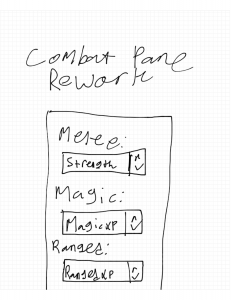
The first modified interface that I want to discuss is the combat pane. The combat pane currently allows you to view your combat level, set attack style, and activate a special attack. In the beta this tab has been changed to not only let you set where the combat experience goes (albeit by a sub-pane) but it also gives you a rundown of the current combat scenario. This scenario overview covers your opponents lifepoints, any prayers that are currently active, and their current weakness. The same data can also be seen for your own character. Also as stated previously this pane carries an option to open a sub pane that allows you to choose what type of combat experience is received. Finally, the option still exists on this pane to toggle auto retaliate.
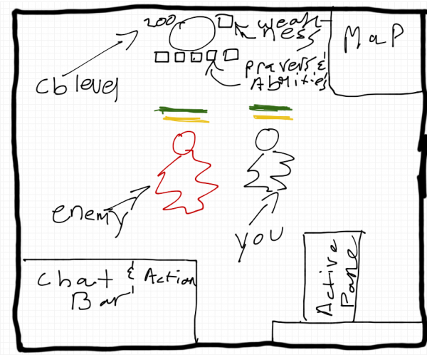
The data displayed in the reworked combat pane is necessary with the changes made to the combat system. While it’s great that the data is only one click away it could be made easier to access by using some form of a floating display on the actual game window. It’s important to be able to know which prayers are active and the interface displayed above ones head only goes so far.
Here’s a rough sketch of how such an interface could be laid out:
The block at the top would disappear when not in combat. A smaller version would be displayed along side the main display showing your current prayers, weakness, and picture. This would ultimately convey the information displayed in the combat pane without needing to move the mouse, point, and click.
Moving to a heads up display would enable those in combat to adapt quicker. This would in turn make the combat changes even more present in the game thus increasing the chance to meet the goal set out with this project.
 The second change I would make to this pane follows from the first. With the combat scenario data moved to a heads up display (this would display only while in combat) this pane would be free to be dedicated solely to choosing the type of combat experience gained and enabling or disabling auto retaliate. This would in turn simplify this pane giving letting it answer one single question: in what way will I engage in combat?
Overall the changes needed to the combat pane are minor. If changes are not made the game play experience will not suffer. However, if changes were made the user would become more efficient at performing their task.
Moving on from the combat pane leads to the Ability Book. The Ability Book takes the place of the current Magic spell book. The Ability Book allows a user to choose a whole host of actions to perform. The Ability Book houses special moves for attack, strength, defence, constitution, ranged, and magic. Also housed under the magic subsection are the spells previously found on the spell book interface. The Ability Book will be a central part of RuneScape going forward.
The only change that I would make to the Ability Book is a change to the icon. Currently the icon is the same as the Magic Book. This is perfectly fine for a new player but once an old player starts to use this interface they will immediately be confused. Over time people develop muscle or visual memory that guides them through an interface. The book is a visual cue that tells players that they can access their magic spells here. Once a player swaps to this tab to find the interface they know is gone their confusion level will increase which is horrible in terms of efficiency. Overall the Ability Book is a great sub-interface. It’s strikingly similar in flow to applications on iOS such as Sparrow or Facebook. Twitter for Mac on also uses a similar interface of vertical tabs. I was pleasantly surprised when I found such an interface in RuneScape.
A brand new element to the RuneScape interface, something that doesn’t happen every year. The Action Bar is what has defined the combat update. The Action Bar is not only limited to combat but can also be used for such tasks as eating and activating prayers/curses (quick curses too!) The use of the Action Bar is extended further by the fact that hot keys can be customized. So many other MMOs use an action bar that this wasn’t entirely unexpected. Before anyone starts jumping up and down let’s be clear in stating that Action Bars are a good type of user interface and can be used in games other than World of Warcraft. Overall the Action Bar was needed and accomplishes its goal of making RuneScape more accessible and less about navigating interfaces.
There’s nothing wrong with the Action Bar but there are a few minor annoyances that could be rectified that might help increase game playability. The first interface element that doesn’t make sense is the trash can. Why is a trash can needed? Why not just drag an ability out of the action bar to delete it?
The last two annoyances stem from having multiple rows. First off upon switching to a different row hot key assignments remain the same for each slot. This makes sense in terms of reducing hand movement on the keyboard but is mildly annoying if trying to group abilities based on type and there are differing amounts of each type required per row. The simplest solution would be to allow each row to have its own customizable hotkeys.
The final annoyance is that only twelve abilities can be displayed at one time. It would be nice if it was possible to have two or three rows of abilities visible at once. This would let the user focus on their objective (destroying someone) and take focus away from modifying a user interface. It is possible to switch rows with the keyboard but in my view these are two extra keystrokes that are not needed.
Overall I was pleased with the interface design as a part of the combat beta. There are still a few things that could be done to change the aesthetics of the RuneScape interface that would improve gameplay. There are numerous things that could be done to the structural interface as well that would improve gameplay. I hope to examine these once the combat beta has been released publicly this fall.
Once Again: Our Future Operating Systems
posted by Shane on 31st March 2012, at 4:57pm | Discuss Article« Previous Page — Next Page »


