What if RuneScape’s UI was consistent?
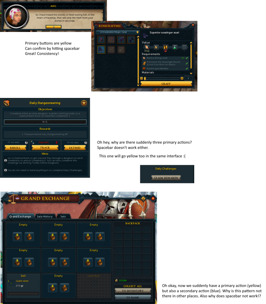
posted by Cireon on 4th May 2020, at 2:40am | Discuss ArticleA while ago I sent Shane the following image (click for full-size version):
It shows how within RuneScape, there isn’t a consistent way the UI is designed. This means that for each interface, you have to “re-learn” how that interface works, what each button does, etc. This may not sound like a big deal, but it is of massive importance in our day to day life. If you’re a Windows user for example, you’ll know that you can always close the current window in the top-right, and most programs have a “File” menu in the top left where you can find some common operations such as save, load, etc.
In the image above, you can see that RuneScape has some patterns that it almost follows, but other screens seem to deviate from it altogether. So let’s open up our favourite image editor, and make some modifications to some screens to see what we can come up with. Note: the images will be somewhat crude, they are just there to bring the point across. If somebody wants to put the time into making some actual mocks, please tag me in Discord with the results!
What are the principles for our UI elements? A UI element should have predictable behaviour. That means it should always behave the same in different places, even if the eventual goal or action is different from place to place. For example, if a shortcut activates the red button in an interface in one place, it should do so everywhere. This means that when you learn that functionality once, you can apply it everywhere.
Let’s start with buttons in general. The bank rework brought with it a new style of buttons:
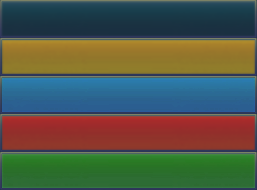
I like that these are simple, so let’s take these buttons as the base from which we will make all the buttons. We already saw that a common pattern is that the yellow button is the primary button of a certain interface, so let’s keep that the same. We also see some blue buttons in places. We haven’t figured out a use for them yet, but let’s make sure we have the option. Finally we also need a green and red variant for yes/no decisions (such as destroying an item). That gives us five button variants in total:
The yellow primary button will be the easiest to work out. Let’s make a rule that there can be at most one yellow button in each interface, and that it is always linked to the spacebar key as well. This makes its behaviour predictable. However, that’s not all we need to solve: we also need to figure out where the yellow button actually needs to be. Let’s follow the rule that we see in several places: the yellow button should always be in the centre of the layout column in controls.
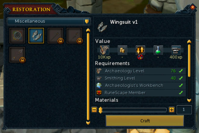
This covers both the dialogue screen and the make-X interface. Below is a quick mock-up with the “craft” button in the new style:
Note that on top of the exact button shape, I also copied the font in a similar style from the bank interface button (but made it black, to make sure we have sufficient contrast). We should always use this font, and not make it larger just because we want to draw more attention to it (that’s what the yellow colour is for). Arguably, the font could be larger, but let’s stick with what we have for now. Also remember the the user can click spacebar to start crafting.
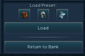
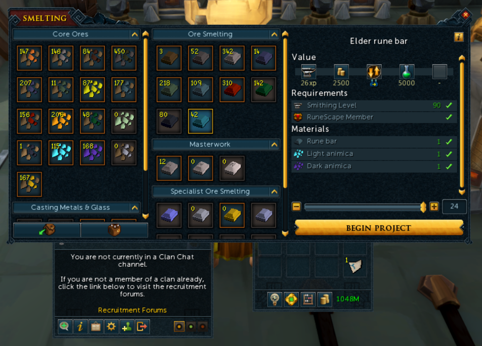
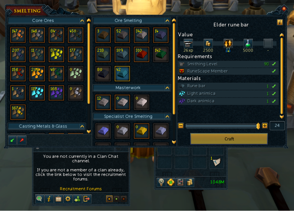
So far so good. The same rule we have above can be applied to the smelting interface. However, the smelting interface has two extra buttons in the leftmost column for depositing and withdrawing materials. These are additional actions for that particular interface. That’s a pattern we see elsewhere too! Look at the following screenshot:
We see the deposit/withdraw buttons stretching the whole width of the bottom, the clan actions being left-aligned, and the inventory has the buttons centred. Let’s say that these additional actions must always be in the bottom left of the layout column they address. My edit looks as follows:
I took the liberty of simplifying the deposit/withdraw icons to fit within the new button size, and added some divider lines to make it all look a bit tidier.
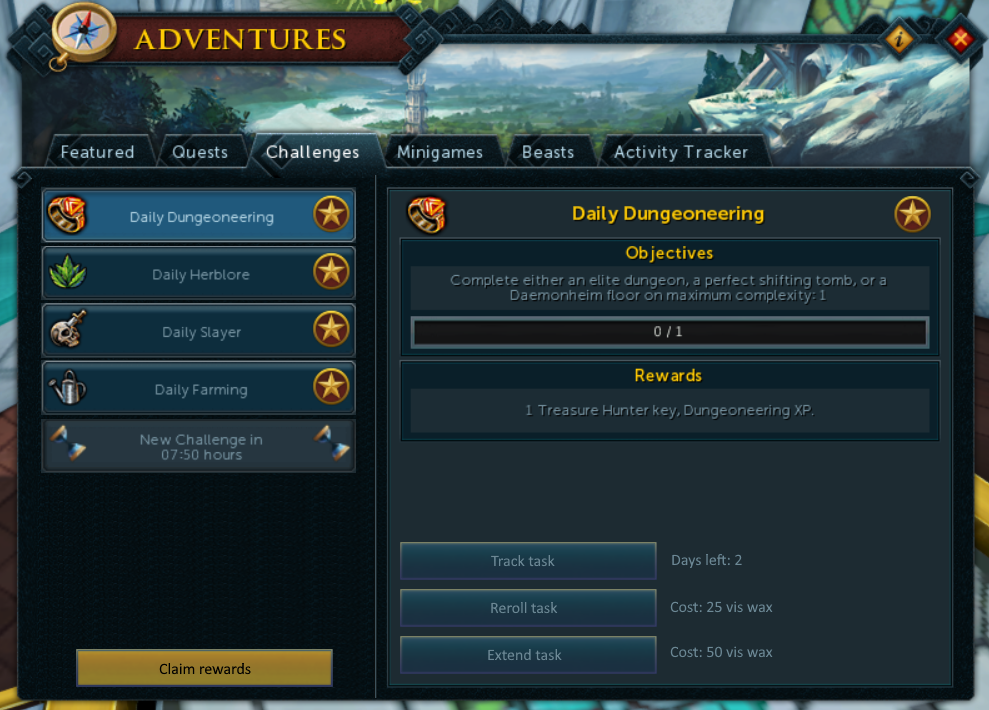
So that’s all good an well, but let’s look at some of the interfaces that I pointed out as problematic in my original sheet. Let’s start with daily challenges: there are a lot of yellow buttons here. Does it make sense for any of these buttons to be a primary yellow button? Yes, I think that claiming rewards is a pretty important thing, so let’s make that our primary action. Per our rules, it needs to be moved to the bottom of that column though.
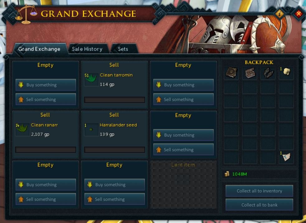
That leaves the three actions you can do within the challenge: reroll, track, and extend. Those are important, and probably need more than a little icon in the bottom right. This makes me think of the Grand Exchange, where we also have two “collect all” buttons. There they are stacked vertically (and have different colours), and in the daily challenges interface we have them stacked horizontally. Maybe we can streamline that as well.
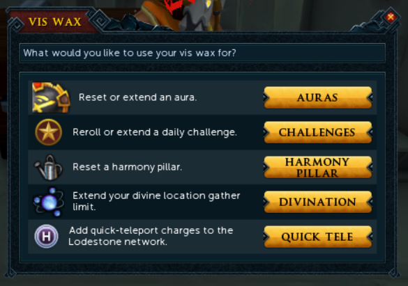
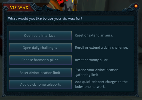
The choices we make here might be fairly arbitrary at this point, and in an actual process you would research all the different UIs, and see what works for everything. In this case, I decided to take some inspiration from the vis wax interface:
The rule I came up with: secondary actions may be stacked vertically at the bottom of a layout column, and should be centre-aligned (identical to primary buttons). Optionally, they may provide additional information or a cost, in which case the button gets pushed to be left aligned.
Below are some quick mocks for several screens following these new rules.
Some additional notes:
- I put the buttons on the left instead of on the right like in the vis wax interface, because it seems to be more common in other programs.
- The observant among you may have noticed that I silently introduced a new rule: the text on a button may be left-aligned if it is accompanied by an icon.
- The buttons to switch between the daily challenges should probably also be changed, but that’s a topic for another time. Additionally, the interfaces are also really inconsistent about whether they have frames around their content, which wasn’t addressed either.
- I changed all the button texts to describe a verb action, which always makes clear what happens when the button is clicked. Choice of text is just as important as style!
- The light blue button style we have left could be use for buttons who have an enabled style. For example, the “track task” button could be made light blue if the task is currently tracked.
- I tried keeping the buttons all the same size, but I had to reduce the width slightly for the Grand Exchange interface.
We could continue this exercise for much, much longer, but then this article would turn into a bookwork, which is beyond the scope. Besides, this limited exercise already took more time than my average article 🙂
I hope this article gives some insight in how UI design should think about consistency, and how you can work towards making the UI much more intuitive. It is a lot of work, because a game such as RuneScape has a lot of UI that needs to be tackled. However, the moment you have all these rules designed, each new UI just has to follow these rules, and players will instantly understand how it functions and what it does. All it takes is agreeing on some rules.


