Building RuneScape for a Tablet
posted by Shane on 30th September 2012, at 4:11pmLast week Jagex released the Noticeboard update and in doing so created some very cumbersome to use interfaces. In the past it’s also been mentioned that eventually RuneScape will be ported to tablets. With these two things in my mind I felt it was time to have a look at what an alternate RuneScape interface might look like.
The RuneScape user interface has stayed largely the same since RuneScape 2 was released in 2004. We saw a minor change when RuneScape HD came out to make it expandable to larger resolutions and another minor appearance change last year. Since 2004 the interface has collected weight and became less efficient over time. It seems as though each new addition was just added on top without care for how it related to the rest of the interface (fact: there are three different scrollbar styles). With the possibility of RuneScape existing on a tablet platform it’s definitely time for something new.
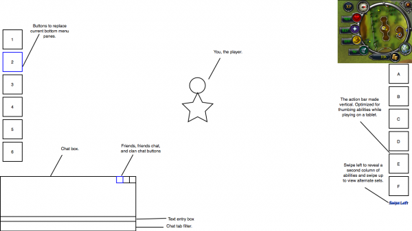
The interface wireframe I’ve created is optimized for touch on tablets and keyboard interaction for classic PC users. A tablet user would be able to play the game while holding their tablet in a landscape orientation similar to a game pad controller. The user would use their thumbs to access the main menu items and occasionally tap on the screen to either move or select a new target. PC users would operate the interface in the same way they have always, click to move, click to select target, and click to select an ability or menu item. Keyboard interaction would be encouraged as abilities and menu items would be accessible through user customizable hotkeys. Overall the learning curve would be very small for users on both platforms since each desired function can still be performed in relatively the same way.
One More Thing…
WASD movement – it’s finally here! For classic PC users WASD interaction makes sense and would increase usability dramatically. Currently RuneScape has the ability to zoom the camera in to the point the user almost gets an over the shoulder perspective. The game also has the ability to rotate the camera by holding the middle mouse button and moving the mouse (some people still don’t know this). Adding the ability to move the character by using WASD should be trivial, this kind of movement already exists with the Orb of Oculus. If a user is currently moving by use of WASD and they move the camera with the middle mouse button this could be interpreted as a turn, allowing precise navigation. Also, the use of WASD to move around would fit naturally with the new hotkey environment.
So now that I’ve told you what the interface can do, let’s have a look at what the wireframes actually look like:
(this PDF is interactive, click on blue objects to toggle the action)
Page 1 consists of the default interface one would find upon logging into RuneScape. Starting off, the chat box and mini-map remain largely unchanged. The chat box has three buttons in the top right corner. These buttons are used to access a fly out panel that shows the current people online from your friends/ignore list, friends chat, and clan chat. These buttons act as toggles, meaning you click one it opens, click it again and it closes. You can see the fly out on page 3 or by clicking the left button.
Moving to the left hand side of the screen (page 1) we have simple click buttons to access menus such as Combat, Stats, Inventory, Worn items, Prayer, and the Ability book. The Noticeboard, Squeal/Solomon, Emotes, Music, Notes, and Settings are also accessible via this sidebar, to access these, simply scroll with your mouse wheel, drag, or swipe if on a tablet. On the right we have the “Action Bar”, 6 actions are displayable by default. To access another column of actions a user can simply drag left or swipe if on a tablet. Page 2 shows a mockup of two columns of actions being displayed after dragging or swiping.
Upon clicking on a button on page 1 you will open up the said panel in a floating window. The floating window can be seen on page 4. In my opinion this is where the current interface in game falls down, really hard. Right now you can only have one panel up from the bottom right menu and it could be in the way of what a user is wanting to accomplish. This is fixed here since these windows are both movable and resizable. A user is also able to have multiple of these panel windows up at a time. Want your stats and inventory up? No problem. This also fixes one of the issues existing currently with skill guides and the noticeboard, a user can’t see the game they’re playing if they want to read a skill guide or fetch something from the noticeboard.
This is of course a very early prototype and would probably go through quite a few iterations before being added into game. It could also go with some detail being added in certain areas. For instance, how can we change the POH settings to be more in tune with the current graphics setting window? Should we split settings into separate icons (graphics, sound, POH, etc.)? Or maybe should the settings go under the log out menu since they aren’t at all related to what your player is doing? All of these issues would be worked out through consultation and user testing.
If you have any questions regarding this interface or want to talk about it, post in the discussion topic!


