How To Avoid a RuneScape Mobile Fail
posted by Shane on 1st July 2020, at 3:11amRuneScape Mobile is a product that players have been craving for years, well beyond the summer of 2017 when the project was first announced. Jagex has done an incredible job of making RuneScape run well from a performance angle on mobile devices, and we’re are at the point with RuneScape Mobile likely being released this year that the focus has to turn to a critique of its usability. There’s a saying in the software engineering world, you can have all the performance in the world but if you have a bad user experience, you have nothing.
I have detailed the issues of the RuneScape Mobile client from a usability perspective a few times on the podcast now but we’ll go for a brief summary here. These are issues that don’t impede the performance of the app but severely inhibit how one feels while using the app.
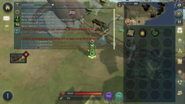
Font rendering on the top level app interfaces is atrocious. If at any given time a player is interacting with the inventory and chat, there are three different fonts on screen at the same time. Font headings in the spell books, prayers, and skills interface are all different, and font sizes are different between the above mentioned font renderings. In the end, a player should not be subjected to multiple different font styles on an interface.
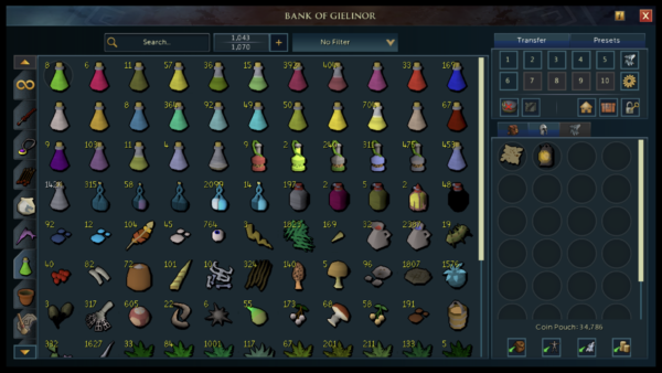
The buttons are also tiny. I have experienced the RuneScape Mobile beta on an iPhone 8 Plus which is a 5.5” screen at a resolution of 1920×1080; it’s not a small phone. The tiny button problem is most exemplified by the bank interface. The chat and bank are no doubt the top two interfaces players interact with. Having a bank that has major usability problems is a huge no-no.
In the bank aside from withdrawing items, the most used feature is presets. Presets are designed with the desktop in mind, and currently the preset buttons are so tiny that it’s entirely possible to tap the wrong preset. This is the case for all buttons in the bank interface and also extends to the close and help buttons in the top right side of the bank interface among others. A player should not have to worry about tapping the wrong button on an interface.
Combat setup is more confusing on mobile than it ever was with the launch of the Evolution of Combat. At the bottom left of the interface always sits the button to toggle your action bar. This will present you with 14 quick fire ability buttons. You can also of course activate revolution. But the act of activating revolution and setting your revolution action bar is difficult.
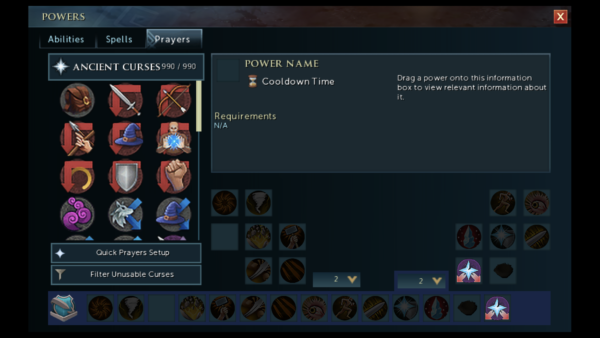
To activate revolution one must go into the Powers interface and tap the sword and shield button in the lower left. On this page also sits two drop down menus for setting action bars. The drop down on the right sets your action bar that appears when pressing the combat button on the main game interface. The left drop down sets an action bar at the bottom of the powers interface. This is the revolution bar.
I want to preface this discussion by mentioning that everything in the last two paragraphs was discovered by me, by accident. I have played since 2004 and consider myself relatively informed when it comes to how revolution works in the main game. A player should not have to discover the interface by trial and error.
The intention as Jagex has laid out is to go to a full commercial launch of the RuneScape 3 Android and iOS mobile beta products later this year. The Apple App Store and Google Play Store are huge store fronts that will bring an influx of new users. Just recently Apple Sign-in was implemented in the iOS client. This means that anyone who downloads RuneScape 3 on iOS can start playing immediately.
This new flow of users will be accustomed to mobile games that are designed mobile first, and RuneScape is a game that is still desktop first and mobile support is nowhere near equal. The incoming user base aside from existing players are players that need a good first tutorial experience, a compelling game loop, and a good user interface on-boarding. RuneScape’s tutorial is ever evolving and is the subject of a different article. The game loop is highly dependent on skill, and the user interface is something the mobile team has direct control over.
The very fact that there are questions about font consistency and legibility, tapping the wrong buttons, and that interface elements are discovered by trial and error speak volumes for first time mobile users. A user shouldn’t have to deal with any of this the first time they launch a new game from the app store.
Apple users are very picky about iPhone applications (and Android users to a lesser degree are picky about their apps too). Applications on the iOS App Store that don’t behave like an iOS application should are often unsuccessful. Right now if RuneScape Mobile launched in its current state, for me, it would receive a rating of a maximum of 2 stars out of 5. The game performs well but its usability is severely lacking for what is expected in 2020 on a mobile application.


