

The Basics of Signature Making – Part 1
posted by Anubis on 31st January 2007, at 11:34pm | No CommentsHey all!
I’m new to the Newspaper Team, and I’m going to be bringing you an article every month, based on the Digital Arts. Most of these are going to be a part of a series of articles on how to improve and start creating digital art, and I’m going to be starting with something which pretty much all of you either can do, or want to do, forum signatures. I’m going to be covering everything which you could possibly need to know about when creating a signature for yourself, and I will be going over the most common mistakes people make when they first start out.
Before I do begin, there are a few words you may not understand which I use quite regularly. Here are a few, and their meanings.
Blend/Blended/Blending – Making a render or image look as though is part of a signature, rather than simply putting a render on top of a background, effects are added to improve the look. There will be a separate article on how to do this.
Brushes – Simply preset shapes to use in conjunction with your paintbrush tool. In this article, “brushes†refers to the sets which you can download or create to add on to your graphics program to use instead of the default ones.
Pixelized – “Blocky.†Pixelized images or text tend to have hard edges, or look like they made up of small squares. They look bad unless they are intended to look like they are sprites.
Render – The image of a character or object (normally from a computer game or an anime) which is placed into a signature to add something for other people to look at.
I’ll be starting with what most of you will start off with when creating your first signature, choosing a render. Now, it may occur to you that this isn’t important, you can use any render as long as it is blended properly. I hate to break it to you, but there is one vital rule you must abide by when choosing a render for your signature.
*Make sure your render has smooth edges!*
So now you have picked your render, you’ll need to create a background to go with it. First thing is first, you need to get some brushes. If you already have your own sets, then that’s fine, this article doesn’t require you to use a certain type, although I wouldn’t recommend using “Vector Brushes†or “Fractal Brushes†as they’ve got certain properties which require a different method of brushing to use properly.
When you have a set of brushes you are going to use, open up a new blank canvas with the size of 450 by 100 pixels.
![]()
If you’ve recently downloaded some new brushes, you’ll want to load them into your program.
Photoshop:
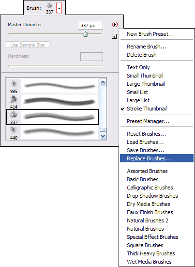
Gimp: Save your brushes in the Gimp brush folder, which will typically be “~/.gimp-2.0/brushes/â€.
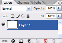
Now, create a new layer by clicking on the “Create a New Layer†icon.
Find your brushes, and start brushing lightly in black on your new layer, changing the brush after every click.
*Remember not to drag your brush.*
![]()
When your layer has been covered by your brushing, again, make a new layer, and begin to do the same with a white brush this time.
Why? When I see people creating signatures on the Rsbandb Forums, I tend to see a lot of what I call bad transition between the brush colour and the Background behind it. Using multiple layers of black and white brushing will give you a larger gradient between black and white, giving the signature a nice flow of colour when you eventually add it.
Repeat this process a few times, switching between black and white brushes, until you have a nice looking greyscale background like this.
![]()
That background has seven layers of brushing, finishing with white. Now, you’re obviously not going to want to use what you have right now are you? Your background has no colour, text or border!
Grab your render that you chose earlier on, make sure you have it in a separate window, and copy it into your signature a few times and arrange them like so;
![]()
Okay, now grab your smudge tool, choose a soft small brush (of about 9 pixels) and go crazy with it, pull out colours, mix colours together, and so on. If you’re using Photoshop, adding a scatter modifier to your brush will help.
When you’ve got a mess of colour, set the layer’s blending mode to Hard Light, duplicate it, and set the new layer to Overlay. You should get something similar to this;
![]()
Well, that’s good, but to make it even better, you need one or two more layers of coloured brushing. Grab your eye drop tool and find a colour which sticks out in your signature. Use your brushes on a new layer to add some details. Do this on two layers with a dark and a light colour from your signature.
Oh no! We appear to have back a step haven’t we? Merge the two layers of coloured brushing together, and set it to hard light once again.
Use the sharpen filter twice, and there you have it! A decent looking background.
![]()
Alas, we’re not quite done yet though, next month I’ll be going over blending your render into the background you create through this article, so over the next four weeks, make a ton of backgrounds and see if you can improve!
Schedule:
February – Backgrounds
March – Blending
April – Text Effects and Borders
Until next time,
~Anubis.
« Previous Page
Tags
 Search