Reaching for the Skies
posted by Mr Bistro on 19th May 2017, at 4:50pmThis month I wanted to cover something that was a smaller update but probably up towards the top of concepts that Jagex has released all year. The update I am talking about is the skybox/screen shade update. It has been a while since there has been an update that has made me stop what I am doing to go online and check it out. This update finally made me.
Mod Shauny’s Custom Skies truly reflects anyone’s desired playstyle. The ability to customize was really easy to find. Just by simply clicking the visualize option on the orb of oculus (or right clicking the world map icon) changes the environment and the sky boxes to the desired theme. On thing that I was worried about was if this would only be active while on the screen using the orb. But it persists for the rest of the gameplay. Even when logging off and logging back on the setting stays. They really thought through the idea of what most people will actually use this update for. One issue that I noticed however was that a teleport did wipe this feature away.
Another cool feature about this update, albeit not very helpful to actually play, is the screen filters used for some of the quests like the finale to the vampire questline. I thought it was cool that these options were included but not on the main screen of choices to pick from. I can see YouTubers using these filters to create some pretty cool content.
But really the main reason I like this update is that I can really theme the way I play the game to my liking. The more years I have played RuneScape or games in general, the more I look for theme. I am a DM for several groups of friends and co workers for dungeons and dragons and have been playing for a little over 7 years. I really look for the theme in the campaign that there is to offer. Otherwise the game falls flat. I feel that RuneScape has been beginning to suffer from this as well. Fortunately to my surprise. The large release schedule is about to finally kick off and give that theme of play that I have been wanting.
If this update is a taste for what thematic settings Jagex wants to put the game in then I will fully buy into that and give them all the support and praise I can. But I think we don’t need to keep dragging on about theme in the game. What are my favorite filters?
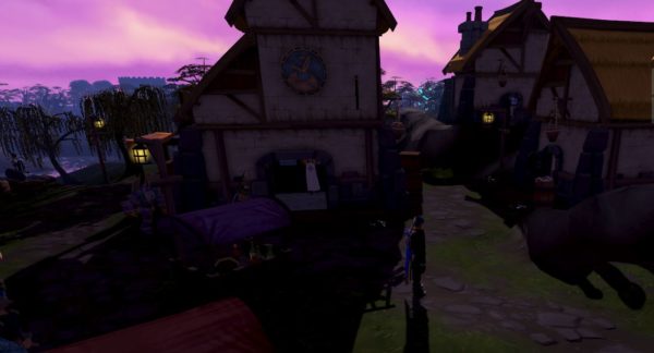
Dusk is a very wonderful filter, the purple hue and low lighting gives the feeling of mischief and danger. The idea that something is about to happen. I don’t think I could use this filter for long periods of time as the screen becomes quite dark but it really adds a layer to the game and gives me a sense of made up mystery that I love!
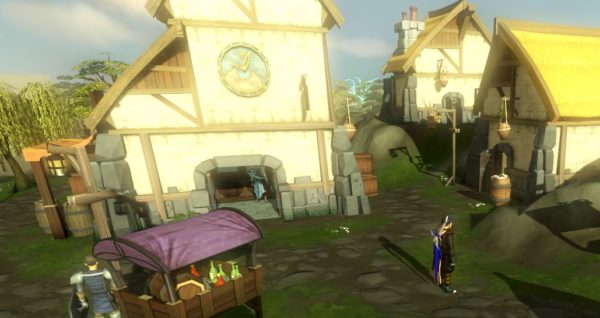
Dawn is also really neat, I don’t really feel it adds much to theme but I could see myself turning it on in the early morning just to match the real world The effect really leans on bloom so make sure that is enabled if you can use it.
Throne is rather creepy. It has a swirling purple pink sky and a warm set of colors over the land. I don’t really know when I would use this one but it’s the first filters that don’t recreate the day feel.
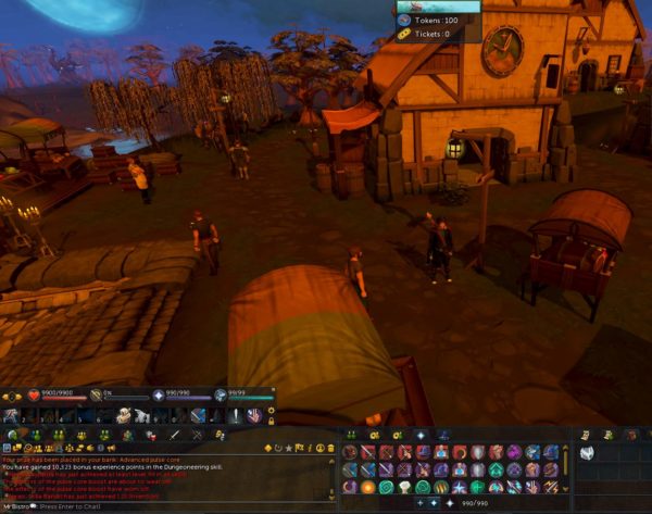
Bonfire. This one right now has to be my favorite. The rich orange colors on the land and the moon in the sky really amazing. I could probably play on this version all day. The stars in the sky really contrasts to the land as they are complementary colors and it really works here.
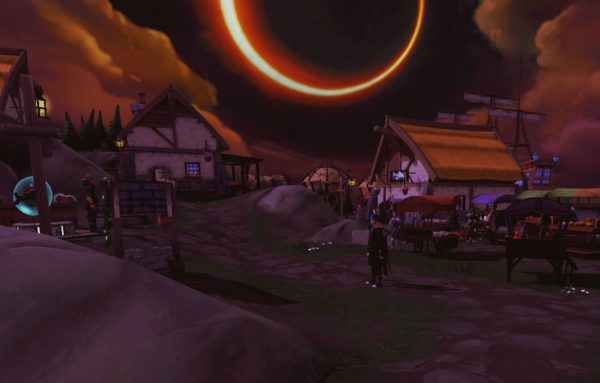
Eclipse is badass. I turned it on and I thought I broke the sky boxes only to find out that there was an actual eclipse happening with clouds in another direction. Super cool.
And now it’s time to get to some other themes that really fell flat more me. I don’t really want to add images to these ones as this article will just become a gallery and there needs to be an option for self discovery here. Goshima takes on a washed out grey appearance like being on the Pacific coast up by Seattle. It can be kinda creepy but is overall really hard to see and requires more adjustments to actually use.
The River of Blood hallucination screen filter is available. I really don’t understand the practicality of this one but looks interesting just like it did in the quest.
The blue shadows effect is cool. It’s not as washed out as Goshima which makes it usable and gives off the overall glume and foggy vibe.
Magic toad is as sherbert and trippy sounding as you would expect. There is no use except for Machinima cutscenes.
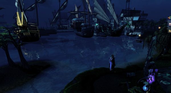
Probably towards the top of my list of favorites is the Aminishi Spirit Realm filter. This one really gives the feeling of gloom and danger that I would say can be related to a Tim Burton movie. Just going to the Port Sarim and seeing the ships brought the themes of that movie into my head. I need to include an image for this one, can’t resist. Also, divination wisps look cool as hell with this filter.
Zemouregal’s Scrying pool turns everything super purple. Enough said.
There are also many old fashioned feeling filters like warm, cool, sepia, and grayscale. There is a color invert and cel shade which are interesting but these will all mostly likely not see use from me.
Overall this was a really cool update that didn’t need to happen but I am very glad it did because it’s really fun and really allows for further customization of the game. Now if only there was an option to change the interface colors from blue to red like DarkScape…
Until next time, happy gaming.


