Nowhere to Hide Now
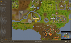
posted by Tim on 29th May 2009, at 3:40pmRead the title and weep. With this new update, there is nowhere to hide now, even Braindeath island. With this newest update the in game Runescape maps have expanded, a lot! Dungeons have now been included into the maps so now you can’t get lost anywhere in Runescape.
Now, I know some of you might not like having “You are Here” arrow (I know I don’t like it) because you know where you are, well, now you can get rid of it with a couple of clicks of your mouse. As you can see in the picture above, there are now ways to get rid that arrow. But that’s not all with the new maps. Jagex has added a lot to the in game maps. One of the more noticeable ones is the new Dungeon “!”s. This update is all about looking at the dungeon faster. All you need to do is click on the icon and you’re looking at that dungeon! It’s that simple. Another thing you can see is the “Intra-map links”. Those are just little yellow squares that show you where from one place to another is. You move your cursor over the yellow square and it will show you where the portal, long distance agility route, etc will end up at. Nothing more to really say about it. Next thing that’s now is the “Map labels”. That is just the text that shows overtop of the areas that have text in them, like “Fire Giants” labelled in their area in the Chaos Tunnels. All that really is, nothing more about it. And the second last update to the map is the “Icon tooltips”. Now, personally, I had no clue what that was but then it hit me. It’s the skin coloured box that shows up when you go over an icon on the map and it tells you where it will link you to. Well, that’s really it about the Map update other than the new layout to it.
Next up is the new Spam filter! I know a lot of people how do repetitive tasks where the same text appears over and over again (like “You swing your hatchet at the tree.” and “You get some logs.”) and that brings your eye’s away from a conversation. Now all you have to do to get rid of all the text is to right click “Game” and click “Filter” and all that text is gone!
Filtering out text is genius! I wonder why they didn’t do this sooner. A lot of skills that brought your attention away are now going to be better to train with because now you can talk with your friends with having the repetitive text coming up and taking away the conversation from your sight. I know this is going to allow me to take Screen shots of funny Clan Chat moments.
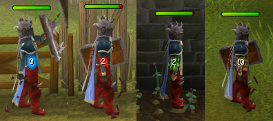
And the final big update that came out this week was the updated Health display system. They did a big overhaul of the HP system so now we have a new HP bar, which has been changed according to the amount of HP the monster has, all the way to new hitsplats.
At first, I honestly didn’t like it. It reminded me just too much of Runescape Classic but I’ve now gotten used to it. Now I think that the little shield for the 0 attacks is a little to much but it was in need of a new look. Something that was flashy and I think they did it.
Now, along with these updates there have been other ones, like the new graphical look the tool leprechauns. They have now been graphically updated and moved closer to the farming patches they are bound to. They have also made a big change to the Free to Play worlds. They have removed all the options that least to members-only content like pickpocketing, agility shortcuts, members’ quests and more. This is meant to make the Free game what it should be, a great game in its own way. However none of these features will be removed from the members’ game. Well. That’s all I have to say for now. Tim out.


