Review : Runescape HD BETA
posted by Anubis on 2nd July 2008, at 10:00amRuneScape has very recently experienced the first major graphical and game engine upgrade since the release of the RuneScape 2 beta and I’m sure you’ll agree with me when I say, “Finally!” It does seem that, although the graphics are certainly not comparable to those on the main consoles, that there will be much less talk about RuneScape’s graphics being terrible and that being the reason why “No-one should play it”. There have been a few complaints that people can’t handle the new graphics at all, which used to be completely unheard of. After all, since the graphics require no more than a computer that has been bought in the year 2005, the majority of players should be able to handle it. If not, you shouldn’t really expect people to wait for you to catch up.
First off, I would like to mention that the main website has been updated into a more modern looking games website. It’s colourful, easier to navigate through and perhaps more importantly, that outdated horrible logo has been changed to a newer prettier one. It does appear Jagex is beginning to move along with the times and realises it can’t be the stubborn brick wall of a company we’re all used to.
The first game related update I recognised was the new title screen. Now while this had been regularly changed when a new skill was released, it suddenly reverted to it’s original design a few weeks after – meaning that the same title screen had been around since RuneScape 2 was released. Now though, we find ourselves with a brand new one. Whether or not this will stay through the update I don’t know, but I sincerely hope not; it’s beautiful. The title screen has a few new features this time around. Namely animation in the background, showing off some points of the RuneScape world and of course the large list of graphics options. For those interested, the graphics options will default to the highest possible detail with the exception of anti-aliasing (which is the smoothing of pixellated edges) so you’ll just need to turn that on if you can handle it. The graphics menu needs to be change so a player can see all options at once, rather than a large scroll bar. Unfortunately, the RuneScape theme tune has not changed and so I immediately turned it off and put my own music back on. This way, I felt I could write a rather nice review for a change rather than rip the bollocks off of the musical department for three paragraphs.
I logged in, and after a good few minutes of loading I arrived in the centre of the Grand Exchange where I had logged off (apparently). I instantly went onto the full screen setting and hit the Print Screen button, but, it doesn’t like full screen screenshots. I just got a large canvas of black void when pasting it into paint or your graphics program. The new full screen interface is quite difficult to work around at first. It may be just me, but I felt that the chat box was too insignificant when compared to the massive resolution I’d played at. It was out of the way and hard to keep an eye on both what was being said in clan chat as well as focussing on play time. The skill icons in the bottom right corner seemed mixed up and although they weren’t, I got lost a good number of times. Although, it’s evident that if you’re going to remain playing on the full screen mode you’ll get used to the new interface a lot quicker than someone who doesn’t, like me.
I played around for a bit in the full screen mode to see what the benefits of doing this were. I instantly noticed the mist in the background. Now, while I’d like to have the range of this extended or at least have the option to in the graphics options, this is by far one of the most un-criticisable updates I’ve come across. Normally, when it comes to RuneScape updates, I’d be able to pick and chew at the bugs and problems until nothing but the raw bone was left. However, this is just pure improvement. The last thing I want to point out about the full screen mode is that instead of actually being able to see more, you’ll be faced with an enlarged version of the default runescape applet. Now while this is not entirely a bad thing, it does make me want to go back to the normal size. Why? Because I have to move my mouse more to do the same things that I would do in regular mode. The full screen mode itself makes you want to press the up button on the keyboard and have your avatar travel forwards but instead you have to click around like a crazed infant to move anywhere. One of two things needs to happen with the full screen mode and that’s either the addition of keyboard shortcuts to move around or extending how much of RuneScape map can be seen depending on the screen’s resolution.
Textures appear all over the place now. Before the update, we had the terrible tiled walls in various un-upgraded cities like West Ardougne and Lumbridge. After the update we have good textures on buildings, monsters, summoned pets, our own avatar and even the ground. Considering we had practically none of these before, there’s nothing much to say other than, “Well done.” However, not all is calm in the realm of textures. Oh no. While places like Lumbridge look absolutely beautiful, other, not-so-popular areas like The Grand Tree suffer from texture map distortion. The materials used to make objects look like what they are, instead of a coloured blob, stretch and just look terrible. The Grand Tree itself looked terrible to begin with but I was disappointed when I found more effort had not been taken to renew the area. Overall, the new textures give the game a cartoonier feel to it, appealing to younger players which are, and always have been both the Target Audience of the game and the major part of the game’s population. Quite ironically though, you do still have to be 13 years of age to legally play it.
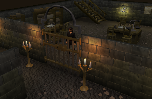
Lighting is another brand new addition via the game’s extensive graphical update. Shadows and glow effects cause depth and improve the overall feel of the game. Places like the Slayer Tower and dungeons excel in this. Anti aliasing, yet another new feature causes characters to appear smoother and enhances the look immensely. In some areas though, it is noted that lighting can sometimes only apply itself to the tile in which it originates. The Dwarven mine for example has a few of these bugs which can be easily fixed after the final version is released.
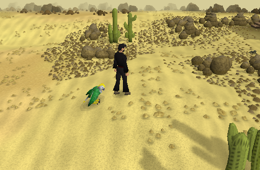
Water has been completely revamped into, well, water. Before we had to put up with a hideous blue texture and die a little inside whenever we saw it. Now though, water looks like actual water except in a few places like Lumbridge’s fountains where it looks like diluted paint. In general though, water has been improved to a mediocre level. What appear to be algae is in some areas, the water in the desert as well as in Al Kharid sparkles in the intense sunlight but unfortunately reflections are missing. Reflections, when it comes to realistic looking water, are everything. Water may be blue to some people, but in fact the saturation of the colour is so miniscule it only comes to light in large quantities such as the sea. Reflections make smaller amounts of water look realistic but don’t seem to be included in the update which is a shame.
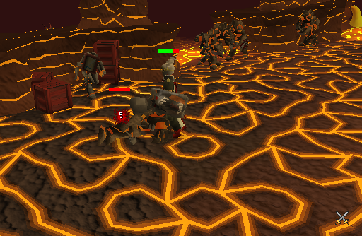
Cities all over the world map have been updated and given a fresh lick of paint. My favourite has to be Al Kharid which I don’t believe had an update ever since I started playing. Environment lighting appears in cities and the grounds around them, causing the colour of your character to change depending on where they are. Take the TzHaar for example, it’s a cave underneath a volcano, lava is seeping through cracks in the walls, the floor and quite possibly the ceiling. So, it’s no surprise that when you walk around the area you’re going to look fairly orange, like an anthropomorphic tangerine. Whilst the cities which have been recently updated before the graphical change were not redesigned, they get the additional benefit of textures and lighting like everywhere else.
The TzHaar below gave me a nice new Obsidian Cape by the way.
Avatars, or more commonly known as your player character, have been upgraded very slightly with a mesh smooth. Regular clothes as seen in some of my pictures have been given textures, as has armour and weapons. This could have been a much larger improvement but it seems increasing the polygons of what Jagex claims to be 130 million players might be a bit too much and could overload the servers. What’s really an improvement though, is that hats and hair can be worn simultaneously for the first time in years.
Finally, as you can see as soon as you log in, the chat heads have been given an extra batch of polygons to mess around with causing a more detailed look. Me, I look like some sort of burly emo kid; how’s that for an oxymoron?
Overall, this update can only be a good thing. It’s a path in the right direction. Jagex does have a lot of bugs and issues to work through but as it’s only the beta stage – I’ll let them off. Perhaps in the future, we’ll see an even higher detail version make it’s way into the public eye and look even better than some of the more popular MMOGs, but maybe that’s just wishful thinking. The game has been completely updated graphically, but it’s worth reminding ourselves that it is just the same game. It’s being run by the same company as before. So any issues you had with it or it’s developers are here to stay, indefinitely. That includes the music, it includes the quests, and although it might cause you to crumble down into tears, it includes pest control.
Enjoy,
Anubis.


3rd July 2008, at 2:41pm
nice article, well written. The one problem I have with the new graphics is on the menu where you view what you’re wearing, the face is like manga-ish with just eyes, nothing else. My character did look a bit girlier, (this is a good thing, the old braphics were pretty manlyish), and I really like what the fires look like now. Good article, those are just my opinions. 🙂
7th July 2008, at 1:47pm
hehe
7th July 2008, at 5:25pm
good story 🙂
19th July 2008, at 7:37pm
Mayi add about the underdeveoloed brick work around west ardrounge. It looks like somthing a 7 year old made on PAINT!
18th November 2008, at 9:02am
Nao Dungeons And Dragons!!!
Nerds!!! 8-]
18th November 2008, at 9:06am
Umm… You guys need to stop playing dungeons and dragons…your wasting your lives, go outside and get some fresh air… and a girlfriend…if you know what that is…go and watch my shows sometime…watch me beat up sasuka…or watever his name is…
18th November 2008, at 9:10am
DUNGEONS AND DRAGONS IS AWESOME!! I WORSHIP IT!!! its my religion I PLAY IT 6 HOURS A DAY AND MY DWAFS ARE NOW ON LEVEL 16 SO THERE! I HAVE FEELINGS TOO YOU KNOW AND MY GIRLFRIEND PENTUINIA IS ON LEVEL 19 WITH HER FAIRY ARMY!!!!! I BET U ONLY PLAY IT FOR 3 HOURS A DAY WHICH MEANS YOUR SAD!!!!!
14th January 2009, at 8:53am
My computer at home wont let me use the HD, but the Library one will. Does anyone know whats wrong? If I click HD It just closes any windows i had open. =(
23rd February 2009, at 4:00am
YEAP I REALLY THINK THE MUSIC IS BAD. I MEAN BAD!!!! I wish Jagex would do somthing with the music it is really annoying and I have to turn it off. Other than that the graphics is great and I like the new fullscreen. Now I dont have to strain on looking at that tiny box they used to have. Good job Jagex!!!
runescape account: Joel2233
28th February 2009, at 5:34am
Now that the BETA period is over, HD is now for free players. Amazing what Jagex have done. And whoever said about the music, jagex have now updated some songs like still night so now they sound better than ever!
4th February 2010, at 6:22pm
Hi, just today found your blog but I have to admit that it seems sweet. I totally agree with you. Have a great day, keep up the nice work and I will definitely come back.I just got in to the Battlefield Bad Company 2 PC Beta for free, check out this youtube video for instructions on how you can do it http://www.youtube.com/watch?v=OeEGe5fIAXo