

Leopard: The good, the bad, and the absolute genius
posted by Matthew on 31st October 2007, at 12:10pmThis month saw the biggest update of Mac OS X ever – OS X 10.5, aka Leopard. A release that has been in preparation for months, years even, Leopard has over 300 new features and is being advertised as the greatest version of Mac OS X ever.
Being as blunt as I possibly can: yes, yes it is.
But no review would be complete without an in-depth analysis of some of the new features and quirks of the operating system. So, this is Leopard: The good, the bad, and the absolute genius.
The good
If I were to say there is a fantastic amount of good in Leopard, I would not be exaggerating. It really is a fantastic operating system, better than Tiger, and Tiger (Apple’s last version of Mac OS X, 10.4) was better, in my opinion, than both XP and Vista, or any Linux distribution I have ever used. Everyone who reads my blog will know I love Mac OS X, but Leopard surpasses Tiger in many ways.
The Finder
The Finder has had a complete refresh in Leopard, and this will be a rather welcome change for many people. The old, brushed metal look of the finder in Tiger and previous versions of OS X is gone and the new clean metal look of the finder is now here. Within the finder is also cover flow (which, I will admit, it more of a gimmick than anything else). A screenshot:

You may also have noticed a few other things about the finder. Down at the bottom of the directory listing you can see the path of the current folder. This is not turned on by default, but can easily be turned on just by selecting View -> Show path bar in Finder. There is also a new sidebar, which resembles iTunes more than the old finder, a welcome change which brings more unity than ever before to applications across Mac OS X. Another useful, but small, feature, is that you now don’t have to Ctrl-click or right click if you wish to empty the trash. Just click ‘Empty trash’.
Front Row
Front Row has been updated from the old, 5th-gen-iPod-esque interface which was in Tiger to a new, fresher, and nicer to navigate interface which is almost exactly like that of the Apple TV. It’s a welcome change, and certainly makes showing your photos, videos and music better than the old version of Front row. There’s also an Application icon within Applications for it now, so you can access it just by double clicking on that. You will, however, still need to have an Apple remote.
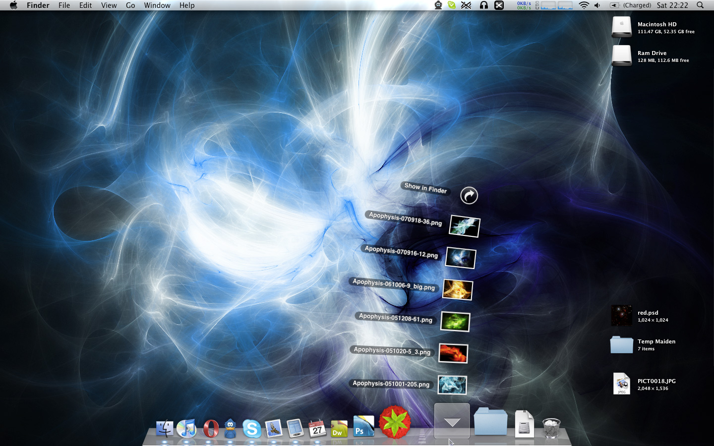
The Desktop
The desktop is one of the best new parts of Leopard – a new semi-transparent menu bar, a new dock, and the new stacks, which were presented as a novelty by so many in the press but are actually an incredibly useful new feature. Instead of having to trawl through finder windows you can now open up anything that happens to be within a stack with just two clicks. And you can make your stacks out of anything – select a few files and drag them to the dock or just drag and drop a folder right of the divider. There’s one there automatically for Downloads, but you can put anything you like there, or remove the downloads stack if you wish.
Time machine
Turning the chore of backing up into something that could almost be called enjoyable really is a brilliant achievement, and the ability to go back in time and restore any file from any point in time is fantastic. A screenshot:

Mail, Address Book and iCal
Being honest, the changes to these three apps are basically standard upgrades, but they are still very good. Mail and iCal are now integrated together through the use of To-dos, which can be created and viewed in either application. Mail has support for RSS now, too, although this support is rather basic and I shall, for now, be sticking with Vienna for my RSS feeds. The updates in Address book are small, although it is a welcome change to be rid of the vulgar brushed metal of the address book in Tiger.
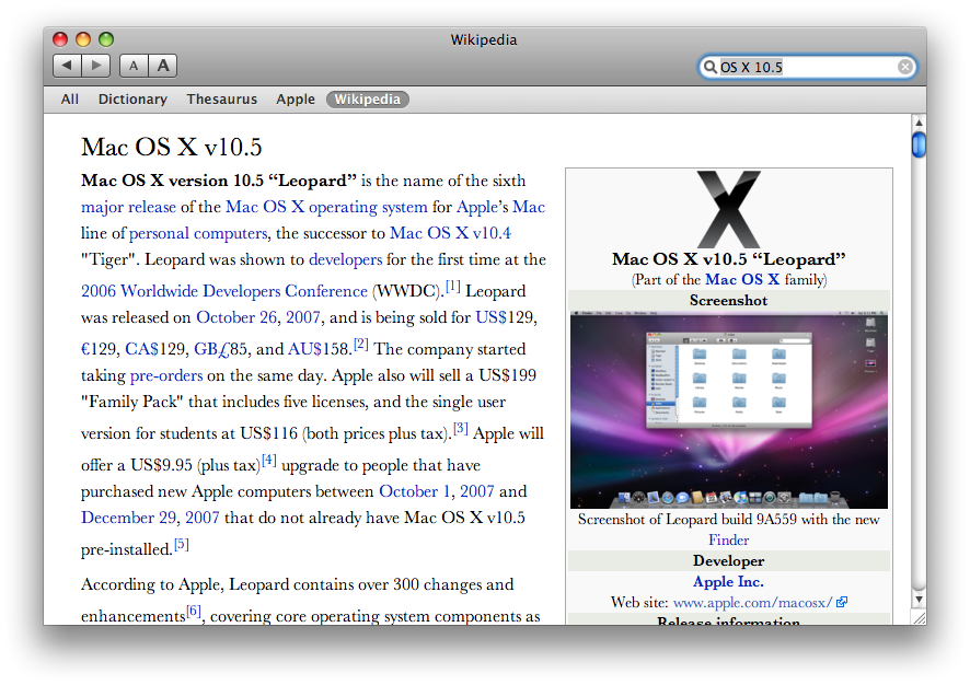
Dictionary
Apart from just looking up words, their meanings and their synonyms like the dictionary and thesaurus of Tiger did, Dictionary in Leopard goes further, allowing you to search Apple help documents, Wikipedia, or all four at the same time, so instead of having to open a web browser next time you want to access Wikipedia, it’s right there within Dictionary.
The Bad
There really isn’t much bad about Leopard I have found so far. But there are a few quirks I would just like to mention.
The Grey
One of the first things you notice about Leopard when you start it up is that the nice, clean, bright, fresh grey of some applications in Tiger is now replaced with a considerably darker grey. The darker shade seems to give an air of more superiority than Tiger, as if it were saying ‘I am Leopard. I am better than all.’ … but perhaps that’s just me. I’m sure I’ll get used to this darker grey eventually, but for now it’s a bit odd.
Front Row’s integration with iTunes
This may seem like an incredibly specific thing to say, but it is noticeable. In Tiger, when you opened front row with your Apple remote, went to your music and played a song, that song would keep playing in iTunes, even after you had exited out of Front Row. The same worked in reverse – play something in iTunes and you could view it in the ‘Now Playing’ section of Front Row. This is no longer the case. Exit out of front row and your track stops playing. Enter front row and your track also stops playing.
Perhaps Apple will fix this in a future update, because it seems a little stupid…
Time Machine
Time Machine is one awesome app, but it is one heck of a resource hog while it’s backing up, especially if you’ve done something like install a large piece of software or if many things in your system have changed. I just installed Leopard Xcode and the Time Machine and Time Machine’s spotlight processes are now using a rather large share of my processor power. Of course, you’re not going to install huge multi-gigabyte pieces of software with thousands of files particularly regularly, but if you do, don’t do any photoshopping for an hour or so afterwards.
The Absolute Genius
You’ve seen the Vista advertising. ‘The Wow is now’. What they don’t tell you, is that the ‘Wow’ they were referring to is merely a stupid, resource intensive, pointless method of switching applications. While it might look good, it serves no real purpose and the ‘Wow’ quickly turns into ‘What’s the point?’.
The ‘Wows’ you get on a Mac are somewhat different to this, however. They’re more like ‘Wow… that’s just right. Sensible, and awesome. Perfect’. Those of you who have used OS X and have seen Expose will know how useful and awesome that is – just move your mouse into a corner of the screen or press F9, and you get a view of all your open Windows. After that just click on one to focus it.
But that’s a Tiger feature. Leopard is full of even more of these features, and I’ll take a look at some of my favourites.
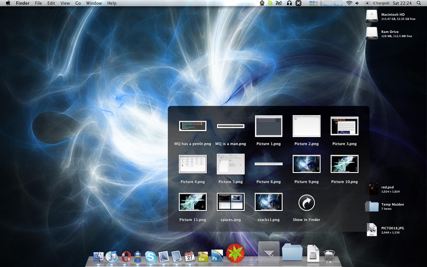
Stacks
Yes, they’re awesome. You cannot begin to image how useful they are unless you have used them for yourself. The ability to open a recently downloaded file in just two clicks without messing up your neat and tidy desktop is incredibly useful.
The new help system
There’s a new application-wide help system available in Leopard, which sits quietly in the Help menu of every application until you come to it. Can’t remember where a specific command within the plethora of menus in your particular application? No problem, just click Help, and search for the menu item you want. A screenshot (click to enlarge):
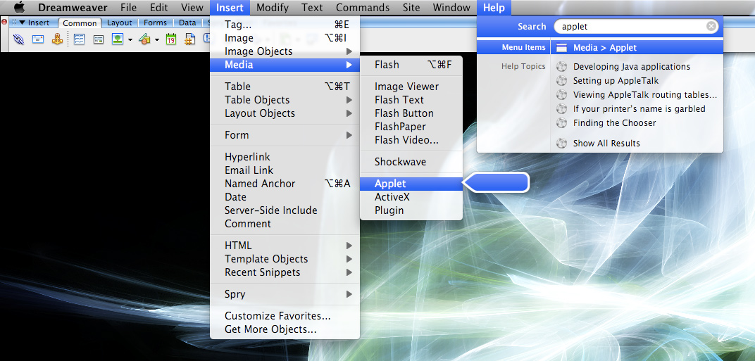
That strikes me as absolutely genius in all respects. No longer do you have to trawl through menu after menu searching for what you want (and I can tell you, I have done that with Photoshop on more than one occasion).
Quick Look
Whoever invented quick look at Apple really needs to be given a myriad of cookies. In any other operating system, you have to open another application, which can take precious seconds, to quickly preview a file. That is no longer tha case in Leopard – you just hit the space bar or press the quick look button on the Finder toolbar and you have an instant preview of your file. Sure, Preview in Mac OS X is a lightwight app, and opens within two seconds, but having it right there with the space bar is more useful even than preview – and you can fullscreen images and video with quick look, as well as listen to music clips without having to go through the trouble of adding them into your iTunes library and then deleting them afterwards when you decide you don’t want them.

In conclusion, is Leopard a good upgrade? Certainly. Leopard builds upon the multitude of features in Mac OS X that are ‘just right’. Time Machine is arguably the most important of the new features, provided you have a backup hard drive handy; although the other features as well make coughing up that $129 or £85 a worthwhile thing to do. Stacks to spaces, Leopard is a giant leap forward for computing.
A secondary conclusion: If you haven’t already, get a Mac!
 Search